GENERAL POINTS TO REMEMBER - SUMMARY FOR ME TO APPLY TO IMAGES
DECONSTRUCTION is both HISTORY and THEORY
It more of an attitude than a style - it looks into how the value is in the through process behind the layout and format.
It looks for HIDDEN CONTRADICTIONS
It shows that something isn't black and white, it it is not one thing or another, it is the combination of one thing and another
e.g. Nature depends on culture, but culture is part of nature. You can have one thing without the other
e.g. Its now form or content - it is form and content, cant have one without the other
It is NOT A RESTRICTED movement - combination of everything.
It looks at how the construction of things can be deconstructed/arranged so that you become aware of how the construction of something allows you to read/see it in the way that you are meant to.
READABILITY AND LEGIBILITY
DAVID CARSON
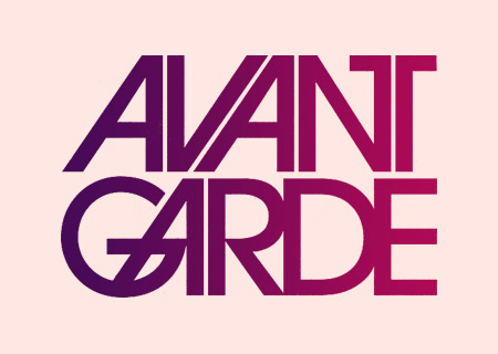
EXAMPLE 1
- This was example we were shown in the seminar - I have used it again as it is a good example of deconstruction graphic design; the image shows that it is not constricted to one particular movement, it joins and constrast many.
- The contrasts and combination of the tradition typeface and the ransom letter style typography

EXAMPLE 2
- This is a Front Cover to the magazine BULB. The manipulation of text and the abstract arrangement forces the reader to think about how they would read it, it is not arranged so that the text is read for them.
- The abstract format of overlapping and blending grabbed my attention, this piece of graphic design to me has a resemblance to photograph negatives - use of the layer of black where the words are cut out to see the background.

EXAMPLE 3
- This piece of is a sample of a typography book cover. It has a strong resemblance to the work of DAVID CARSON - deconstructionist.
- Abstract arrangement and contrasts of size of text. Some of the text is displayed within an image - this makes the viewer look closely and read every part of the page.
- The manipulation of the historical the image in the background
- Traditional and modern typeface - contrasts of the serif type at the top left with the sans-serif type at the bottom of page.
- There is no 'logical' format of the page - the layout is the content - organised layout made to look disorganised

EXAMPLE 4
- Here there is no clear indication of where to start reading the text. The combination and contrasts of text and image - overlapping makes the page look a bit of a jumble and creates the distortion of typography.
- It is unusual how as well as the word 'WEIN' is written in black - it is also used for the circles and the arrow - making them stand out and asking the question...are they as significant as the title?
- Reading into the colour of the piece more...the use of black and white and shade of grey could be reference to the theory of deconstruction - how, something it not just black and white...it is black and white WITH shades of grey

EXAMPLE 5
- This is a piece of DAVID CARSON'S work
- Use of extreme distortion of text - the text is almost unreadable in parts. The word 'decay' is shown to be actually dissappearing/decaying.
- Abstract arrangement of text - horizontal and vertical arrangements around the main words - the text is made to look more like an image
- Contrasts of different size, style of font - not hugely readable.
- The images stands out - very innovative - organised disorganisation.