Friday, 25 February 2011

DECONSTRUCTION - Discussion of Examples

GENERAL POINTS TO REMEMBER - SUMMARY FOR ME TO APPLY TO IMAGES

DECONSTRUCTION is both HISTORY and THEORY
It more of an attitude than a style - it looks into how the value is in the through process behind the layout and format. 
It looks for HIDDEN CONTRADICTIONS
It shows that something isn't black and white, it it is not one thing or another, it is the combination of one thing and another 
e.g. Nature depends on culture, but culture is part of nature. You can have one thing without the other
e.g. Its now form or content - it is form and content, cant have one without the other 
It is NOT A RESTRICTED movement - combination of everything. 
It looks at how the construction of things can be deconstructed/arranged so that you become aware of how the construction of something allows you to read/see it in the way that you are meant to. 
READABILITY AND LEGIBILITY
DAVID CARSON


EXAMPLE 1

  • This was example we were shown in the seminar - I have used it again as it is a good example of deconstruction graphic design; the image shows that it is not constricted to one particular movement, it joins and constrast many. 
  • The contrasts and combination of the tradition typeface and the ransom letter style typography


EXAMPLE 2
  1. This is a Front Cover to the magazine BULB. The manipulation of text and the abstract arrangement forces the reader to think about how they would read it, it is not arranged so that the text is read for them. 
  2. The abstract format of overlapping and blending grabbed my attention, this piece of graphic design to me has a resemblance to photograph negatives - use of the layer of black where the words are cut out to see the background. 


EXAMPLE 3
  • This piece of is a sample of a typography book cover. It has a strong resemblance to the work of DAVID CARSON - deconstructionist. 
  • Abstract arrangement and contrasts of size of text. Some of the text is displayed within an image - this makes the viewer look closely and read every part of the page.
  • The manipulation of the  historical the image in the background
  • Traditional and modern typeface - contrasts of the serif type at the top left with the sans-serif type at the bottom of page. 
  • There is no 'logical' format of the page - the layout is the content - organised layout made to look disorganised


EXAMPLE 4

  • Here there is no clear indication of where to start reading the text. The combination and contrasts of text and image - overlapping makes the page look a bit of a jumble and creates the distortion of typography. 
  • It is unusual how as well as the word 'WEIN' is written in black - it is also used for the circles and the arrow - making them stand out and asking the question...are they as significant as the title?
  • Reading into the colour of the piece more...the use of black and white and shade of grey could be reference to the theory of deconstruction - how, something it not just black and white...it is black and white WITH shades of grey


EXAMPLE 5

  • This is a piece of DAVID CARSON'S work
  • Use of extreme distortion of text - the text is almost unreadable in parts. The word 'decay' is shown to be actually dissappearing/decaying. 
  • Abstract arrangement of text - horizontal and vertical arrangements around the main words - the text is made to look more like an image
  • Contrasts of different size, style of font - not hugely readable.
  • The images stands out - very innovative - organised disorganisation. 


Monday, 21 February 2011

DECONSTRUCTION - notes


TASKS

  • find 5 examples of deconstructive graphic design and talk about why they are
  • want us to think about what frames typography and wrighting and in particular what elements of typography influence content - what is the content of a text/book - the knowlege/ideas/message. The form of the book is type and image (the way it is communicated) (design is secondary to content - be a crystal goblet as a graphic designer)
  • read the sheet and write a 500 word summary about what you understand from it - pick out main points which it says about the role of typography and creating meaning - when found key points, use them to discuss one piece of deconstructive graphic design. 


The implication for thinking about text


Think about text and typography in a critical way - the function of typography in a vehicle of meaning and what its role is
Introduction to the term 'deconstruction' - the philosiphy of jacque derida
Graphic design which has used the philosophy of deconstruction as a model 


DECONSTRUCTION became the dominant mode of graphic design in the 80's (especially in America) - people who considered themselves a GD - considered themselves as A DECONSTRUCTION
its a model for the integration of theory and practice together - a theory which is understood in practice


it is an approach which comes out of post modernism - deconstruction is a tequnique of post modernity


POST MODERNISM

  • po-mo attitude of questionin conventions (especially modernism) - 
  • po-mo aesthetic = multiplicty of styles and approaches - get replaced by millions of different competing styles
the pictures - anti aesthetic, designed to be as tastless as possible, doesnt rely on any colour theory. references to different eras (high and low culture) - pluralism. There is a critique of the modern world - 

DECONSTRUCTION/ DECONSTRUCTIVISM/ DECONSTRUCTIONISM


Ellen Lupton is curator of contemporary design at Cooper-Hewitt, National Design Museum in New York City and director of the Graphic Design MFA program at Maryland Institute College of Art (MICA) in Baltimore. An author of numerous books and articles on design, she is a public-minded critic, frequent lecturer, and AIGA Gold Medalist. Read More

Deconstruction and Graphic Design

Ellen Lupton and J. Abbott Miller. Published in special issue of Visible Language on graphic design history, edited by Andrew Blauvelt (1994). This is an earlier version of the essay “Deconstruction and Graphic Design,” published in our book Design Writing Research.
Since the surfacing of the term “deconstruction” in design journalism in the mid-1980s, the word has served to label architecture, graphic design, products, and fashion featuring chopped up, layered, and fragmented forms imbued with ambiguous futuristic overtones. This essay looks at the reception and use of deconstruction in the recent history of graphic design, where it has become the tag for yet another period style.
We then consider the place of graphics within the theory of deconstruction, initiated in the work of philosopher Jacques Derrida. We argue that deconstruction is not a style or “attitude” but rather a mode of questioning through and about the technologies, formal devices, social institutions, and founding metaphors of representation. Deconstruction belongs to both history and theory. It is embedded in recent visual and academic culture, but it describes a strategy of critical form-making which is performed across a range of artifacts and practices, both historical and contemporary.
Jacques Derrida introduced the concept of “deconstruction” in his book Of Grammatology, published in France in 1967 and translated into English in 1976. “Deconstruction” became a banner for the advance guard in American literary studies in the 1970s and 80s, scandalizing departments of English, French, and comparative literature. Deconstruction rejected the project of modern criticism: to uncover the meaning of a literary work by studying the way its form and content communicate essential humanistic messages. Deconstruction, like critical strategies based on Marxism, feminism, semiotics, and anthropology, focuses not on the themes and imagery of its objects but rather on the linguistic and institutional systems that frame the production of texts.
In Derrida’s theory, deconstruction asks how representation inhabits reality. How does the external image of things get inside their internal essence? How does the surface get under the skin? Western culture since Plato, Derrida argues, has been governed by such oppositions as reality/representation, inside/outside, original/copy, and mind/body. The intellectual achievements of the West—its science, art, philosophy, literature—have valued one side of these pairs over the other, allying one side with truth and the other with falsehood. For example, the Judeo-Christian tradition has conceived the body as an external shell for the inner soul, elevating the mind as the sacred source of thought and spirit, while denigrating the body as mere mechanics. In the realm of aesthetics, the original work of art traditionally has carried an aura of authenticity that its copy lacks, and the telling of a story or the taking of a photograph is viewed as a passive record of events.
“Deconstruction” takes apart such oppositions by showing how the devalued, empty concept lives inside the valued, positive one. The outside inhabits the inside. Consider, for example, the opposition between nature and culture. The idea of “nature” depends on the idea of “culture,” and yet culture is part of nature. It’s a fantasy to conceive of the non-human environment as a pristine, innocent setting fenced off and protected from the products of human endeavor—cities, roads, farms, landfills. The fact that we have produced a concept of “nature” in opposition to “culture” is a symptom of our alienation from the ecological systems that civilization depletes and transforms.

  • DECONSTRUCTION - approach associated with post-structuralism and JAQUES DIRRIDA
  • Blended with 20s Russian constructivism - deconstructivism in architecture
  • Visually interpreted in Graphic Design = sometimes called Deconstructionism
  • Hilight rose of Cranbrook Academy of Art, US
  • Emphasise not a style but an approach - it is a way of analysing and thinking about something
JACQUES DIERRA I
  • approach to texts which analyses their systems of representation - the systems which frame their communication
  • instead of looking at the surface level meaning - you look for the HIDDEN CONTRADITIONS beneath the surface level meaning, in particular the systems which surround text which GIVE them a meaning - we try and uncover these meanings and how things are given a closed/single meaning. 
  • in the west we have a philosophical approach things in a black and white format - interesting for us is the idea of FORM AND CONTENT/SPEACH AND WRITING as oposition - he talks about getting under the surface
  • he says how there isnt 2 sides to things there are a million. 
  • talking about communication - spoken and written - the speach is more privalidged as it is more spontaions and requires the presence of a person - under this theory, wrighting is the INFERIOR copy of speach, wrighting is just there to copy speach - wrighting is artificial.
  • ORIGIONAL vs COPY in relevance to graphic design
  • NOTHING is either one or another, they are similtaions both and simultanious neither.
  • he says wrighting is not inferiour to speaking but it is speaking itself - gramatology - taking something which is given, breaking it up and then show that it isnt as black as white as it origionally appears. 


characteristics of typography - type/weight/serifs/san serifs/spacing/page setting/grid - do these convensions are just a vehicle for the content or do they affect the content - are they secondary to content or do they create the content e.g. book - text is about being legible - it doesnt have a voice whereas a poster has a character and voice and says something about it. FORM MATTERS AS MUCH AS CONTENT 


THE TEXT (sheet)

  • typography as a dicaplin aims not just to make it easy, to almost do the reading for you - the way paragraphs are spaced and sentaces are stopped/one font means something and the other means something else - it reads for you and stops the effort of reading - takes you out of the process of reading. STANDARD IDEAS OF TYPOGRAPHY MAKE YOU STOP READING - when you are reading it isn't you that is reading it is the writer that is reading thought your head. 
  • ERRORS AND OWNERSHIP - it is inarguable, its the one true meaning (books hand written to books typed) - when a page is printed it is insists that it is correct and there is one meaning that is unchangable and you don't start to think about how the writer could be changing his idea etc - gives one signified. 
  • LINEARITY - the difference between a work and a text - 
  • each typographic act is an attempt to capture the book........
CRANBROOK ACADEMY OF ART 
  • where deonstructavists started 
  • the page - columns - the tactic of making it look like columns makes you aware of the mechanism that makes you read...through the reading of it it makes you think about how you are reading it...using the internal contradictions - every word and every space on the page affects the meaning - the juxtaposition of meaing and text - you dont and you do - both work together and both work seperately. It is a text which uses typography to expose the hidden meanings of typography - it makes you read, it doesnt allow you to mindlesssly read through, it makes you look at form - typography which is critiquing itself. 
ROLAND BARTHES 
  • the illusion which creates something and which you can communicate to someone else and they understand it as that. People can and should be readers and bring their own interpretations to the table, people chose not to but they still should
STRUCTURALISM


Structuralism argues that a specific domain of culture may be understood by means of a structure—modelled on language—that is distinct both from the organisations of reality and those of ideas or the imagination—the "third order". In Lacan's psychoanalytic theory, for example, the structural order of "the Symbolic" is distinguished both from "the Real" and "the Imaginary"; similarly, in Althusser's Marxist theory, the structural order of the capitalist mode of production is distinct both from the actual, real agents involved in its relations and from the ideological forms in which those relations are understood. According to Alison Assiter, four ideas are common to the various forms of structuralism. First, that a structure determines the position of each element of a whole. Second, that every system has a structure. Third, structural laws deal with co-existence rather than change. Fourth, structures are the "real things" that lie beneath the surface or the appearance of meaning.
In the 1970s, structuralism was criticised for its rigidity and ahistoricism. Despite this, many of structuralism's proponents, such as Jacques Lacan, continue to assert an influence oncontinental philosophy and many of the fundamental assumptions of some of structuralism's critics (who have been associated with "post-structuralism") are a continuation of structuralism.

IMAGES - DECONSTRUCTION examples

(david carson is a very good example of deconstruction)


Monday, 7 February 2011

Discuss the Concept of 'Avant Guard' in relation to Graphic Design

The term 'Avant-Gaurde' refers to art, music and politics which is innovative, experimental, progressive and involves new concepts and techniques. It opposes the mainstream creations of the time and challenges the social movement allowing constant historical improvements. In relation to Graphic Design, something which is 'avant-gaurde' can challenge your thinking about a subject, this is best shown through advertisting.

POSTER 1


The shocking juxtaposition of concepts showing a scene at night with body bag in the middle of the road in the shape of the bottle is innovative and challenges the viewers thinking, with a car crashed into a tree in the background. It makes people sit up and think about the comination of drinking and driving, using the pun on the name of 'absolute vodka'. The poster is approching the subject of drink driving from a different angle; instead of saying 'don't drink and drive', they are showing the result and letting the viewer think about the consequences, an innovative, thought provoking way of getting a message across.


This piece of Graphic Design is shown on the road in relation to its material (road tar) to elevate the shock factor which it is trying to portray. The message is personal, it is just text but uses the shock factor of the shear size to make the viewer stop and think about what is being said. It looks at the risks of smoking from a different angle. Normally the public are warned through images and figures, however here you can actually see the size of the impact the damage smokers do to themselves.


I feel that these posters both show elements of innovative ideas of approaching the subject, it challenges the social concepts and movements and are both thought provoking pieces. One uses imagery and text and the other uses text and material. Advertising has to be simple as people do not take much time in looking at them in passing, these are effective and experimental.

Tuesday, 1 February 2011

DEFINING THE AVANT-GARDE (impressive/innovative)


for the portfolio - discus this work in referent to graphic design.

OBJECTIVES
understand the term 'avant-gaurd'
question the way art/design education relies on the concept of the afant-gaurd
understand the related concept of 'art for arts sake'
quesiton the notion of genious
consider the political perspectives relation to avant gardism
question the validy of concept 'avant-gaurd'

DEFNINTION -

idea of doing art/design work that is PROGRESSIVE - innovating
ALSO referes to the idea of there being a group of people being innovative

being avant guard int the work you do - challenging, innovating
being part of a group - being a member of the avant-gaurd
(constant historical improvements) - challenging the social movement

MARCEL DUCHAMP

THE FOUNTAIN -
LHOOQ -
trying to shock people, taking the piss out of the steriotyped art, challenges conventional understanding of what is and it question who gives meaning to art and the avant guard and get them to read into the systems which surround art. DUCHAMP only picks ready-mades which have no aethetics and that he had no feelings about eg urinal

FAUVES - wild beasts, shows reality of subject matter but challenges in the painitng style, very impressionistic.
REALIST PAINTING - comfortable fanticy but painted in very realistic style (naturalistic)

COLLEGE PROSPECTUS - design with polotics

criteria for this college (art)

  • innovation - creating new stuff
  • experimentation
  • ogigionality
  • creative genious
the artists among the college would say that designers are less creative than them because we work to briefs and for clients and we take money therefore are not at the same level. The principles of this institution which educations various different designers and artists, the concepts above are fine art concepts but applied to any sort of design. this is epitimised from the dropping of 'design' in the name of this college. It highlights the links to the hierarchy...art is at the top and graphic design is near the middle

OLD WAY - you would spend hours immitating and learning from other people/drawing the same things for hours over and over again until you get it right, then go to the background - then when you get so good you become your own artists - you emerge into the world not as an individual genious but as the voice of anothers inperpreation. 

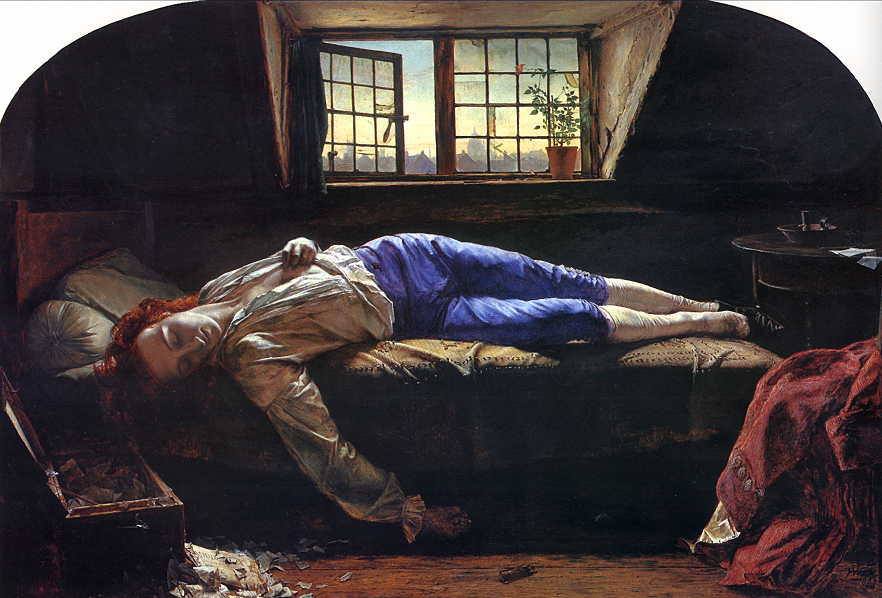
DEATH OF CHATTERTON


he used to be a beacon but the reason he is living in a shit hole is because he cant sell any of his works. This myth still applies today (every fine art student) - they say that they are just in there for the 'expression'. Art is less about individual genious

This leads to the situation of ELITASIM - you belive you are better than everyone else

COURBET - THE STONE BREAKERS - he uses the working class as the subject matter, they are not looking at the viewer and engadged in their work. shows the circle of life - youth and elder, showing that there is no change and this is the potential his life is going to reach. Paintings were commissioned by the rich so UNUSUAL to have SM.

ART FOR ARTS SAKE

they try to create a system of system of aethetic experimentation.


SIGNIFICANT FORM - the relation sand combination of lines and colours, which when organised give the prover to move someone aesthetically. 

art is seen as more valuble because there is MORE WRIGHTING about the art rather than design. This produces a system of concential knowledge. These critics are only needed when art becomes IMMIDIATELY meaningless to other people. 
VALUE is given by tastemakers

CLEMENT GREENBERG - made a career out of wrighting about abstract expressionists. He wrights about JACKSON POLLOCK/. Pure art - showing drama etx. No polotics and no message


a major problem for the avant-gaurde is that it seems to necessitate ELITISM
so for those memebers of the left wing (interseed in social change) there was a tentandcy to have to rely on ACADEMIC TECHNIQUES in order to appeal to the public

BEATRICE WARDE - the crystal goblet
the fate of the graphic designer - if you are good...you should be  invisible. the good designer is invisible. the then you can never have ur voice heard as a graphic designer. aim for invisiblilty and graphic designer


DESIGN FOR DESIGN SAKE - aesthetically experimental - the idea of people understand/read it


WHAT IT KITSCH 
it aspires to be like art  but fails in some way. To call something KITSCH you have to make a judgement of taste - but who decides what is tasteful
vernacular typography

  • jumping accross media
  • simplification of style - repainted masterpieces for the modern eye


Kitsch (English pronunciation: /ˈkɪtʃ/, loanword from German) is a form of art that is considered an inferior, tasteless copy of an extant style of art or a worthless imitation of art of recognized value. The concept is associated with the deliberate use of elements that may be thought of as cultural icons[1]while making cheap mass-produced objects that are unoriginal. Kitsch also refers to the types of art that are aesthetically deficient (whether or not being sentimental, glamorous, theatrical, or creative) and that make creative gestures which merely imitate the superficial appearances of art through repeated conventions and formulae. Excessive sentimentality often is associated with the term.
The term kitsch is considered derogatory, denoting works executed to pander to popular demand alone and purely for commercial purposes rather than works created as self-expression by an artist.[2] The term is generally reserved for unsubstantial and gaudy works that are calculated to have popular appeal and are considered pretentious and shallow rather than genuine artistic efforts.[3]


THOMAS KINDAKE - he calls himself the 'painter of light' in a guild frame

so in a democracy if everyone likes something then shouldn't it 


Tuesday, 7 December 2010

Task - 5 sourced examples of Modernist design

KEY POINTS - it was an anti-historic movements, so the idea behind the movement is to look forward
  • lacks unnecessary decoration/ornamentation
  • Form FOLLOWS Function
  • use of SIMPLE and sans-serif fonts e.g. Helvetica
  • flashed left and ragged right margins
  • Abstract forms
  • Universal design language
  • Use of Grids and geometric/angular forms
  • simple use of colours
  • 4 MAIN CHARACTERISTICS
    • aesthetics self reflectiveness
    • photo-montage
    • use of Paradox, Ambiguity, and Uncertainty
    • loss of an integrated subject


TASKS - below have a chosen 5 images of modernist graphic design and made brief notes/bullet points about how they reflects the modernist style.


IMAGE 1

  • Piece incorporates the use of geometric and angular shapes, which are represented in simplistic and representational use of colours - red symbolises the Russians/communists. 
  • Use of abstract forms - surrounding the big 'wedge'
  • function comes before FORM
  • There is no unnecessary decoration to this piece, it is clear and simple and hence there is a loss of an integrated subject.
'BEAT THE WHITES WITH THE RED WEDGE (1919) - EL LISITSKY


IMAGE 2
  • Simplistic geometric shapes - in a clean, simplistic arrangement
  • basic use of colours and stock
  • sans-serif font (Helvetica)
  • form follows function
  • just basic shapes used, no  unnecessary decoration - universal design language. 


IMAGE 3
  • Photo montage combined with bold, angular shapes and typography - abstract forms/way of presenting the photograph with curved in sides
  • sans-serif type face


IMAGE 4
  • Photomontage - combined black and white images
  • angular/geometric shapes
  • sans-serif typeface - helvetica


IMAGE 5

  • clear simplistic design - block colours. 
  • no unnecessary use decoration, just simple forms and lots of black used - stamp like effect to the poster


Monday, 6 December 2010

Revolutionary Design - Notes

It is named Revolutionary design due to it being the most changing type of design. 


RUSSIAN MODERNISM
The October Revolution

  • The Bolsheviks's - group of revolutionists/armed workers, they rose together to over throw the Zarish Regime (poverty vs sickening wealth)
  • The movement occured when the worlds communists countesi was made the USSR - that everyone is equal and the wealth is collectively owned - "run by and for the people"
  • Russian October Revolution 1917 was led by Lenin. October (10 days that shocked the world_ = 1927 - Director = Sergei Eisensten
  • 1917-1921 was the Russian Civil War
WHAT SYMBOLISES THE NEW ERA? (shown in film)
  • workers puts his fut on the crown 
  • starting to impose a social security, no more homelessness and everyone has to have own land
  • smashing of the wine - to make everyone equal - represents getting rid of the luxeries of wine and lying around
  • stealing cutlery - showed that everything is shared out
  • kid on the throne - birth of a new era
  • religious imagery, spitting on the floor 'the curch always worships the leaders' they were ruining the Dutchess' bedroom infront of the religious paintings
  • Clocks - sybolising internationalism and that all over the world this revolustion is happening - the world is united. 
  • PROPEGANDA - in reality the revolution wasn't as smooth as the film showed. Alot of artists and designers got involved
  • Deceptive/Manipulative portraying of things
  • 80% of Russia was illiterate at the time - alot of visual material published to spread the Bulshavik view 
IMAGE
  • Figure is dressed as an everyday workman - symbolic of unity. The Bolshavic power towers over the rest of the town/country
  • Red - Russian flag, it represent the blood of the martyres and colour of COMMUNISM and that this is the cause they strive for. 
  • White army - the anti communist movement
  • social funcation
  • Still relies of the language of oil painting - the art of the old regime
  • Bolshevik - wanted to comunicate in their language (art)
  • From then on - intense articstic experimentation to try and comunicat a language to the public (1917 to mid 1920's) 
 YCTACH OBKA
  • Simple shapes and colours opposed to the old, compicatd and showing off pictures
  • represented = machine/industrail asthetic - workers main experience is of factories which reflects their work and also faith in technology/future 
  • Workers are portrayed in the painting - ver unusual and new
  • Artistic experiment prevails up until Stalin - he bans this new style as he thought it was too new and fightened him - he felt it was too similar to the CAPITALIST West
LATE 1920'S - SOCIALIST REALISM

  • This painting = propegandad about the COMMUNIST culture - good wealth = blue sky and all wearing red shirts (the cult of a leader)
  • When Lenin was in charge he encouridged people to look at modern (Matisse) western painting - they were quickly absorbed - abstract, geometrical, no link with the past, severs historical links. 
EL LISSITZKY


  • 'Beat the whites with the red wedge' - attempt to show the Revolutions, descrive visually the moment it happened through the juxtaposition of shapes. 
  • red invading the white - the winter palace gates. 
  • WEDGE - ensures that the doors will then stay open, it grows with power by starting small. It represents AVAND-GARD, the pinnacle - changing the cutting edge.
  • PIONEERS - shattering and piercing the heart of the previous regime.
  • art and design have a SOCIAL purpose in designing the future - totally different from western - they were just left to experiment at their will. 
BOOKS - RODCHENKO
  • Commissioned to be put outside reading rooms for them to come into rooms and self educate (as there was a low literacy %)
  • peasant woman (not privileged) showing education is for all. Female - not just men who can be educated. They gain a higher status on Revolution, they have as much progressive role in Revolution - equal rolls in Revolution
  • Wedge - opposite way round but the same motif - starting small and they spreads out
  • Book - written in RED which shows the communist progress. 
  • Attempt to look at industry and technology
  • she - ecstatic - modern means to present modern ways. Photography - never lies, to more truthful/realistic
  • Designed to serve a social unity. Designed out of a language which is new
  • Reflects modern, rev social aim, looks forward NOT back. 
  • The historical part is the enemy of this moment
  • Lots of experiment with photography contact - 2 negatives sliced together creating a superimposed image. 

LEMIN - building future he is helping and mucking in with the workers. very radical and new. there is a reference to the wedge. 
PRINT MEDIA became very important to them - mass produced which result of revolution

COSTRUCTAUISTS - The idea of emphasising that they were vital/contributing to the future (designers)
  • they are structural experiments wich could be applied to future building
  • this is a laboratory of ideas, socially useful things. 
TATLIN's model of the Monument to the Third International
  • commissioned to come up with somethign to represent/commemorate
  • it looks similar to the Eiffel Tower (3 times bigger than it)
  • unlike the E.Tower it is designed not only aesthetically - lecture theatres, offices of the state and then telecommunications
  • It is on a giant axis showing the extension of the axis of the world through Russia
  • The floors would revolve
  • Atmosphere of experiment that would lead to believe that anything would be possible - utopia
  • The AIM of the CONSTRUCTAVISTS - "achieving the communistic impression of material structures'
  • leveling out the art and design fo the same level
  • The efforts of the worker in factor are as important as the efforts of the art/designer
STEPANOVA & POPOVA
  • wall paper and drapery - trying to use the new geometric language of modernity - equally gets the construcavists treatment
  • fabric designers - the wedge motif is still presetn - the new colours, synthetic colours, new scientific modern colours
  • "the prints have not just become artistically acceptable, but have reached the level of real art...rich colours & intense ornamentation . (decorative arts)
USSR pavilion - innovative which signaled Russia as the cultural leader
Radical architecture, not for the elite - for the working mens club
VKHUTEMAS - predates the BAUHAUS - experimental arts school/innovative
Architecture is 80% male dominated - breaking down of gender gap
CONSTRUCTAVISTS art fits for women 
FORMS following functions
top - wouldn't think it is made for fit women. Fashion is WEST was opposite - figure hugging